Some of you may have seen Opower’s energy user ‘archetypes’ and wondered how they were made. This is conceptually easy to do if you have the data, although there are some subtleties involved in processing the data. We’ll go through these in this post so you too can define energy archetypes.
We build upon the previous blog where we introduced smart meter data analytics, however we go several steps further here, and make some neat visualisations that are both informative and cool looking. The following code is essentially from the previous blog.
url <- "https://files.datapress.com/london/dataset/smartmeter-energy-use-data-in-london-households/Power-Networks-LCL-June2015(withAcornGps).zip"
download.file(url,destfile = "data/data.zip",mode = "wb", method="wget")
unzip("data/data.zip","data/data.csv") # I strongly recommend unzipping this file manually, not with R

library("readr")
df <- read_csv("data/data.csv")

uk_holidays2013 <- ymd(c('2013-01-01', '2013-03-29', '2013-04-01', '2013-05-06',
'2013-05-27', '2013-08-26', '2013-12-25', '2013-12-26')) |
- Since we’ve already gone through the preprocessing steps explicitly in the previous post, I will dispense with the explanations. Suffice it to say:
Filter our unecceseary columns - Only look at the year 2013
- Remove duplicates
- Only consider data that is 100% complete
df <- df %>%
  transmute(ID = LCLid,
            DateTime,
            kWh = `KWH/hh (per half hour)`) %>%
  filter(DateTime > ymd('2013-01-01'),
         DateTime <= ymd_hms('2014-01-01 00:00:00')) %>%
  distinct() %>%
  group_by(ID) %>%
filter(n() == 17520) |
Let’s look at just one household
library(ggplot2) df %>% filter(ID=='MAC002506') %>% ggplot(aes(y = kWh,x=rep(1:48,365),group=as.factor(date(DateTime)))) + stat_smooth(method="loess",se=FALSE,span=0.2,geom="line",alpha=0.1) + labs(x = "30 minute period of day") |
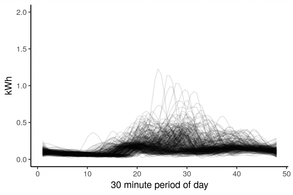
This household looks to have a consistent night time behaviour, then during the day it varies. One issue of concern with this type of clustering is the behaviour of households on weekends and holidays. The difference in behaviour will dilute the quality of the clusters. One solution is to simply filter out weekends, and public holidays. We will do this, and only look at the cooler months.
library("tidyr")

df %>% filter(ID=='MAC002506') %>%
  mutate(weekday = weekdays(DateTime),
         Mnth = month(DateTime),
         PHol = if_else(date(DateTime) %in% uk_holidays2013,TRUE,FALSE),
         Date = date(DateTime)) %>%
  filter(!weekday %in% c("Saturday","Sunday"),
         year(DateTime)==2013,
         Mnth %in% c(11,12,1,2),
         !PHol) %>%
  transmute(Date,DateTime,kWh,
            DateTime=format(strptime(DateTime, "%Y-%m-%d %H:%M:%S"),
                            format="%H:%M:%S")) %>%
  ggplot(aes(y = kWh,x=rep(1:48,nrow(.)/48),group=Date))+
stat_smooth(method="loess",se=FALSE,span=0.2,geom="line",alpha=0.1) |
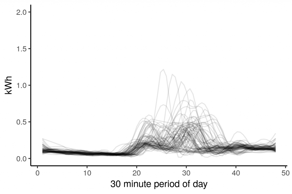
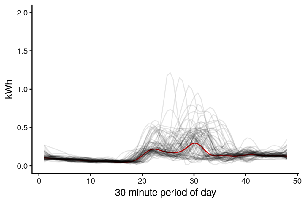
We’ve thinned out the data somewhat, there are still some outlier days. It looks like someone spent a few days home sick, with the heater set to 11. We can take the median consumption for each period across the days, which should exclude the outliers.
df %>% filter(ID=='MAC002506') %>%
    mutate(weekday = weekdays(DateTime),
           Mnth = month(DateTime),
           PHol = if_else(date(DateTime) %in% uk_holidays2013,TRUE,FALSE),
           Date = date(DateTime)) %>%
    filter(!weekday %in% c("Saturday","Sunday"),
           year(DateTime)==2013,
           Mnth %in% c(11,12,1,2),
           !PHol) %>%
    transmute(Date,DateTime,kWh,
              Time=format(strptime(DateTime, "%Y-%m-%d %H:%M:%S"),
                              format="%H:%M:%S")) %>%
  group_by(Time) %>%
summarise(kWh = median(kWh)) |
If we overlay the median (red) on the raw data, we can see it approximates a ‘typical weekday’ for this London household in winter. You can trivially alter the code above to explore weekends and warmer months.
Calculating median consumption for all households
Let’s generalise the code so it applies to all households in the data set.
df_med <- df %>% ungroup() %>% # ungroup previous groupings
    mutate(weekday = weekdays(DateTime),
           Mnth = month(DateTime),
           PHol = if_else(date(DateTime) %in% uk_holidays2013,TRUE,FALSE),
           Date = date(DateTime)) %>%
    filter(!weekday %in% c("Saturday","Sunday"),
           year(DateTime)==2013,
           Mnth %in% c(11,12,1,2),
           !PHol) %>%
    transmute(ID,Date,DateTime,kWh,
              Time=format(strptime(DateTime, "%Y-%m-%d %H:%M:%S"),
                          format="%H:%M:%S")) %>%
    group_by(ID,Time) %>%
    summarise(kWh = median(kWh)) # median to filter outliers

# and plot the data
df_med %>%
  ggplot(aes(y = kWh,x=rep(1:48,nrow(.)/48),group=ID))+
    stat_smooth(method="loess",se=FALSE,span=0.2,geom="line",alpha=0.1) +
labs(x = "30 minute period of day")+ |
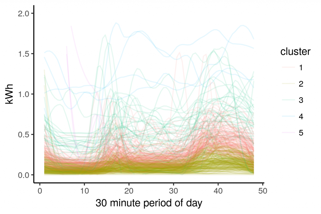
So these lines represent the median usage of all households in the dataset, let’s try to cluster these using the kmeans clustering algorithm in R.
df_k <- spread(df_med,key=Time,value=kWh) # aribitrarily choose 5 clusters, you can play around with this df_k$cluster = kmeans(df_k[,-1],5)$cluster df_k %>%
  ungroup() %>%
  transmute(ID,
            cluster = as.character(cluster)) %>%
  inner_join(df_med) %>%
  ggplot(aes(y = kWh,x=rep(1:48,nrow(.)/48),group=ID,colour=cluster))+
  stat_smooth(method="loess",se=FALSE,span=0.2,geom="line",alpha=0.1) +
labs(x = "30 minute period of day", color="cluster") |
This is a cool looking plot but ultimately not very informative for segmentation purposes. The clusters blend into each other based on magnitude rather than forming distinct groups that describe how the households consumed electricity. We can get a better sense of a houehold’s behaviour by normalising the consumption before clustering.
Normalising smart meter data
We’re going to normalise using the maximum, for example, if the sum total half-hour recorded usage is 12 kWh, we simply divide all that households recordings by 12 kWh. This way the area under the consumption traces will be 1 for each and every household in the data set. This permits more distinguished comparisons that in this case improve the efficacy of our clustering algorithms.
df_med <- df_med %>% group_by(ID) %>% mutate(norm_kWh = kWh/sum(kWh)) df_med %>% ggplot(aes(y = norm_kWh,x=rep(1:48,nrow(.)/48),group=ID))+ stat_smooth(method="loess",se=FALSE,span=0.2,geom="line",alpha=0.1) + labs(x = "30 minute period of day") |
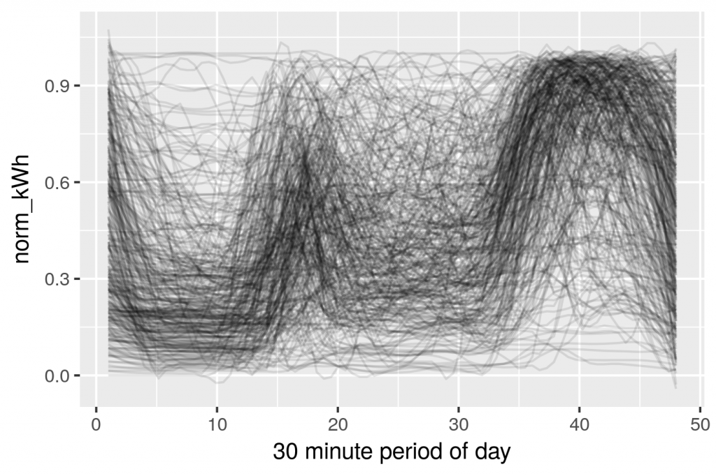
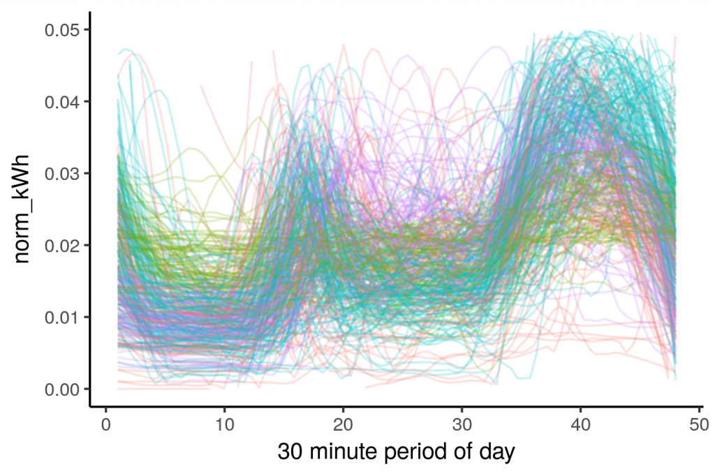
This is looking more interesting, the individual profiles aren’t clumped around the bottom any more. Let’s run the clustering code again.
df_k <- df_med %>%
  group_by(ID) %>%
  mutate(norm_kWh = kWh/max(kWh),
         norm_kWh = if_else(is.na(norm_kWh),0,norm_kWh)) %>%
  select(ID,Time,norm_kWh) %>%
  spread(key=Time,value=norm_kWh)

# aribitrarily choose 4 clusters, you can play around with this
df_k$cluster = kmeans(df_k[,-1],4)$cluster

df_k %>%
  ungroup() %>%
  transmute(ID,
            cluster = as.character(cluster)) %>%
  inner_join(df_med) %>%
  ggplot(aes(y = norm_kWh,x=rep(1:48,nrow(.)/48),group=ID,colour=cluster))+
  stat_smooth(method="loess",se=FALSE,span=0.2,geom="line",alpha=0.2) +
labs(x = "30 minute period of day", color="cluster") |
The shapes really jump out in this cosmic illustration of normalised smart meter data. I can see how energy used during the middle of the day was used to split the groups. The code can be easily changed if you want to explore different numbers of clusters. There is still a bit of cleaning up to do which I’ll cover in the next post, including a novel way of filtering outliers.

